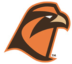
The new fonts are pretty cool. I'm not totally crazy about the new "secondary" logo, as I think it's at least a little bit goofy. I'll give it a chance to grow on me, though. As long as the original logo remains "primary," that's all I care about. I think it will--this new logo isn't exactly screaming "timeless" at me.


New logo and athletic font, courtesy of the BGSU Athletics' Official Website
No comments:
Post a Comment